I wanted to title this post, ‘Why standard deviations are damaging businesses,’ but half the potential readers wouldn’t get past that headline to this opening sentence. Not because they wouldn’t think the content could be interesting. Because the term standard deviation creates dread and anxiety in many businesspeople.
For these people – despite being successful, achieving, happy professionals today – standard deviation triggers negative recollections of a school math class. ‘Standard deviation. Did not understand it back then, did not like it back then, still don’t. Let me do something, anything else, rather than read about it now.’
For those who shudder at the term, I needed to find a way to get it on the table. Though they thought it was the last they would hear of standard deviation when they graduated, as successful executives, leaders, managers, and consultants, all these years, it has silently hurt them.
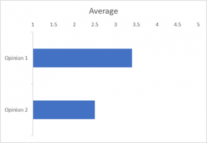
Standard deviation, or the lack of consideration for it, causes billions of dollars of waste. Flawed transformations, initiatives that don’t solve the original problem, and compromised careers. This damage is due to its omission in processing the simple, quick surveys conducted when making important decisions. Think strategies, mergers, improvements, transformations, innovations, and the like. The surveys that generate their results as a bar graph. Where you look at the top to see the items with the highest average and to the bottom to those with the lowest.
The bar graph copy/pasted into the executive report-out PowerPoint. With the explanation that the items at the top are good, but those at the bottom are bad and are where leadership should take action. Action that might be to review and revise the company’s channel strategy, upgrade the succession planning process, replace the quality management IT system. Projects that take a year or two and cost a few million dollars. While consuming the time of dozens or more colleagues, with all the related business disruption.
When they’re concluded and called complete, projects born from this error leave executives unsure things are much better. You hear, ‘Perhaps the project didn’t have enough change management, or the project management could have been stronger. Or, ‘We did it well, but conditions have changed since we started, so probably something else is now causing the problem.’
Logical, often partially accurate, rationalizing that too often misses the source issue – the bar graph and the ‘obvious’ but flawed insight that the top things were good and the bottom ones were bad and needed the attention.
The truth was that the third from the top item – that seemed to be ok – was actually in the worst state. The bar graph was misleading you.
How? The answer is in that standard deviation tucked away on the survey results page. Not easy to see, not something most care to look for. Don’t understand how to take advantage of it, a statistic for the math geeks.
Here is a simple example to illustrate how the omission causes business decision errors.
 You have two opinions about the performance of part of the business. You have to advise leadership to invest in improving one or the other:
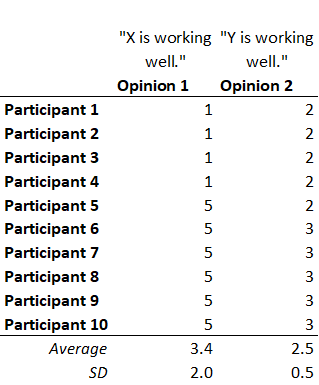
Imagine the leadership team and the owners of X and Y are asked, via a two-question survey, to agree or disagree with each opinion on a scale of 1 to 5. They do, and the results are:
Opinion 2, ‘Y is working very well’, didn’t receive good ratings, significantly weaker than the endorsement Opinion 1 received. The obvious choice here is to say, ‘X is considered to be working better than Y, we should invest our most precious resources – time, money, and management attention – on improving Y. ‘
Wrong.
 Shield our eyes with our fingers and sneak a half-second peak down the survey results page. See Opinion 1 has a standard deviation of 2.0 and Opinion 2 is 0.5. There is no way we can recommend to leadership what they should do, yet. We can’t make a valid judgment about Opinion 1 whether X is working well. The standard deviation of 2.0 on people’s beliefs of the state of X means it could indeed be 3.4. But it could also be 4.5, even higher, and it could be 1.5, even worse than Y’s 2.5.
How, when the people were surveyed and said it was 3.4?
When you look at the responses to each opinion, notice everyone was very close on Opinion 2. They gave it either 2 or 3. But with Opinion 1, most gave it 5’s while others gave it 1’s. Very different views of X, in terms of it ‘working very well.’
Who is right? Is it the 5’s because the 1’s aren’t aware of how good it is? Or is it the 1’s because the 5’s don’t see how bad it is?
From hundreds of situations like this, we learned 35% of the time, the polar opposite 1’s and 5’s within a group is due to different data. Some people have one experience of X, unaware of other people having a very different experience. When you share those experiences, you hear either, “Oh, it’s better than I realized.” Or “Oh, it’s worse than I realized.” That is one way the average of 3.4 becomes a reality that is quite different. When the data is shared, the value moves considerably up or down.
60% of the time, the divergent responses are due to different dictionary – meanings of the words. The ten respondents have different meanings of ‘very well’. Assuming they all have the same data to work from, the same experience with X and Y, some think it adds up to X working very well, and others add it up to X not working very well. Each person has a different ‘standard of performance.’
(Rarely, less than 5% of the time, different drivers or motivations are at play).
When an average has a large standard deviation, don’t draw inaccurate conclusions from its average. Learn why people answered how they did. Their responses will tell you the misalignment was due to different data or different dictionaries. With their reasoning, you can confidently conclude either: X is, indeed, working very well – the 1’s agree and changed their view. Or, X is quite poor – the 5’s changed their original views.
In the former case, where X is even better than the average perceived 3.4, the suggested action to improve Y has more evidence to indicate it is the right choice. But in the latter case, where the 3.4 is shown to be over-stated, it is clear X should be the subject of the improvement, not Y. You just avoided recommending the wrong action.
This hidden flaw in the use of ubiquitous survey tools is not spotted because the leaders being presented the bar graph and recommended actions think it all makes good sense. They are comfortable they are making a data-driven decision. (When, actually, it is a bad-data-driven decision.)
The surveyor believes they helped the executives and the organization make a good decision and go down the right path – when they have done the opposite.
Plus, they triggered the situation where their program management and change management colleagues are going to catch hell months from now. They will hear from at least one executive, “We studied this and came up with the right strategy, but you didn’t get it executed successfully.”
Business performance is a lot about successful execution, but it is no good to execute the wrong thing successfully.
You can prevent this data science quality leak from quietly corrupting leader’s, manager’s, consultant’s and colleague’s great intentions. Take the time to understand the large standard deviations. As a general guide, large is when an opinion’s standard deviation is greater than 20% of the high-to-low response range. Through the respondent’s reasoning, reconcile the divergent responses into an agreed rating for those opinions before creating the bar graph, making the comparison, and recommending action.
 If you are familiar and comfortable with standard deviation, here is its role in managerial decision-making throughout an organization.
Are you unfamiliar and uncomfortable with standard deviation? If so, you do not need to learn the formula or how to compute it. Please accept its impact on the quality of your recommendations and the long-term gain outweighing the short-term effort to understand and deal with it.
(If you want to know how to reconcile a large standard deviation in your survey data, just ask.)
PS For the mathematicians, I realize it is the ‘standard deviation of a normal distribution’ and the Opinion 1 example is not normal. The use of the standard deviation to trigger the recommended analysis remains valid, as the high value indicates the opportunity for an actual state with material variation from the average.
Intriguing and important observations. This discussion points to several adjacent themes.
1. The Flaw of Averages – Sam Savage, Stanford University
2. Consider both the data and the visualization (distribution). Data sets with very different visuals, but the same averages and distributions.
https://www.autodesk.com/research/publications/same-stats-different-graphs
3. “show me the distribution” (standard or otherwise)
4. NOISE: A Flaw in Human Judgement – distributions often reflect noise in data.
https://www.nytimes.com/2021/05/18/books/review/noise-daniel-kahneman-olivier-sibony-cass-sunstein.html
DJ,
Thanks for extending the thinking and technical discussion behind the post’s point. My inference is that many of those I’d like to read the post because they are making the error, are the same people who wouldn’t be reading the articles you reference. At the same time, there are those who will read the post who have no issue with standard deviation but just hadn’t been made aware of how survey results can be misused and will soak up your references, too.
Thanks,
Michael